Embeds
This theme ships some embeds that hide the complexity of rendering the same elements over and over again with the correct HTML.
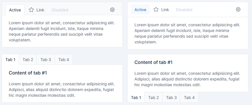
Card navigation
Card nav has been implemented.
Parameters
Card navigation embed, can be used with 4 parameters:
| Parameter | Description | Type | Default |
|---|---|---|---|
| items | Array of Item | array |
[] |
| tabs | Use card for each tab content instead one single card |
bool |
false |
| bottom | Only if tabs is true Set the tabs navigations at the bottom |
boolean |
false |
| pills | Use pills as tab style |
bool |
false |
Item
Note:
Ifhrefparameter is not specified, Boostrap tab navigation will be used to navigate trough elements.
Ifhrefis specified, click on tab will simply redirect to the URL.
| Parameter | Description | Type | Default |
|---|---|---|---|
| id | Id of item (used for bootstrap tab) | string |
tabler_unique_id() |
| name | Name of the item | string |
empty string |
| content | Content of the item | string |
empty string |
| active | Set the item as currently active | boolean |
false |
| disabled | Set the item as disabled | boolean |
false |
| href | Href of the a link in the menu |
string |
#tabs- + tabler_unique_id() |
| raw | Render item name AND content as RAW HTML | boolean |
false |
Content
Card navigation embed, has 1 common block:
| Block | Description |
|---|---|
| card_content | Will replace the content autocomplete from Items -> content |
See twig file for more blocks, which allow customization of HTML tags, CSS classes and more.
Usage
Full boostrap tabs
All content tab must be rendered
{% set raw_html_example %}
    <div class="card-body">
        <h3><span class="badge bg-success">Active</span> content</h3>
        <p class="mb-0">With some text</p>
    </div>
    <div class="card-footer">
        <div class="d-flex">
            <a href="#" class="btn btn-link">Cancel</a>
            <a href="#" class="btn btn-primary ms-auto">Go somewhere</a>
        </div>
    </div>
{% endset %}

{% set items = [
    {
        name : 'First',
        content : 'First content',
    },
    {
        name : '<i class="fas fa-times me-2"></i>Disabled',
        content : 'Disabled content',
        disabled : true,
        raw : true,
    },
    {
        name : 'Active',
        content : raw_html_example,
        active : true,
        raw : true,
    },
    {
        name : 'Url',
        href : 'https://www.w3schools.com/',
    },
] %}

{% embed '[@Tabler](https://github.com/Tabler)/embeds/card_nav.html.twig' with { items : items, tabs : true} %}{% endembed %}
Href single content
Only one tab content is completed, rest is only for navigation between urls
{% set items = [
    {
        name: 'Account',
        href: '/account'
    },
    {
        name: 'Notifications',
        href: '/notifications',
        active: true,
    },
    {
        name: 'Experience',
    },
    {
        name: 'Feedback',
    },
] %}

{% embed '[@Tabler](https://github.com/Tabler)/embeds/card_nav.html.twig' with { items : items, tabs : true} %}
    {% block card_content %}
        <div class="card">
            <div class="card-body">
                <h2>Single page/tab content</h2>
                <p>
                    I'm a content that will not be changed.<br/>
                    Even if you click tabs!
                </p>
                <blockquote>Useful when one tab correspond to one specifics URL</blockquote>
            </div>
        </div>
    {% endblock %}
{% endembed %}
Next steps
Please go back to the Tabler bundle documentation to find out more about using the theme.
How can I help you explore Laravel packages today?